Eastman Kodak (as opposed to Kodak Alaris) impinged on the awareness of the photographic industry this month with the announcement of a Kodak Ektra smartphone, and a weird new logo.
 The Android-based Kodak Ektra is basically a brand licensing deal partnering with a UK outfit called The Bullitt Group. Kodak says it is designed with photographers in mind: ‘A unique hybrid of photography innovation and DSLR functionality’.
Eastman Kodak CEO Jeff Clark made a flying visit to Australia last week to spruik the development. Ektra is a Kodak-owned brand applied to a range of products over the years, commencing with a 35mm camera in 1941.
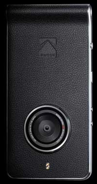
The Ektra smartphone camera is controlled by a ‘virtual’ touch-sensitive SLR-style Scene Selection Dial, where offering HDR, Landscape, Portrait, Macro, Sport, Night-time, Panorama and Bokeh, alongside a Smart Auto mode. In Manual mode users can adjust exposure, ISO, focus, white balance and shutter speed.
Kodak Ektra features:
– Android 6.0 (Marshmallow);
– 21-megapixel camera sensor, f2 lens, PDAF, OIS, Dual LED Flash;
– 13-megapixel phase detection auto focus front-facing camera with f2 PDAF;
– Helio X20 2.3GHz Decacore processor with 3GB RAM;
– 32GB memory, expandable with MicroSD cards;
– Advanced Manual Mode – adjustable on Exposure, ISO, Focal Length (Manual/Auto);
– White Balance, Shutter Speed, Aperture (fixed f2.0 main camera);
– Includes scene modes Smart Auto, Portrait, Manual, Sports, Bokeh, Night-time, HDR, Panorama, Macro, Landscape, Film / Video;
– Super 8 Video Recorder;
– 3000mAh battery, with USB 3.0 Type C fast charger.
The Kodak Ektra smartphone will initially be released in Europe, with a recommended price of around A$720.
![]() While the Ektra smartphone at least boasts a handsome design, the same can’t be said for what they have done to one of the most recognisable logos of the 20th Century. In the eye of this beholder, it’s a hatchet job.
While the Ektra smartphone at least boasts a handsome design, the same can’t be said for what they have done to one of the most recognisable logos of the 20th Century. In the eye of this beholder, it’s a hatchet job.
The familiar square, red and yellow Kodak logo was unchanged from 1971 until 2006, except for dropping the serif typeface in favour of a san-serif font in 1987. In the new version, the word ‘Kodak’ is laid out vertically in capitals, and is supposed to represent the sprocket holes in film.
That oddity, combined with the thickening of the yellow outer frame make for an unhappy marriage of design elements. But who knows, whoever Eastman Kodak deals with these days may grow to love it!
A single, belated entry into the smartphone market; a ‘digital’ Super 8 camera; a dodgy-looking new logo. What are they smoking these days in Rochester?


More to the point….what are they smoking here!
With the camera held in vertical format the Logo looks just like a phone (from the 70’S) I guess that’s apt.